A user reports a slow application.
In a traditional managed services model, the process is familiar. A ticket gets raised. An engineer investigates logs. Teams escalate across infrastructure, network, and application layers. Hours may pass before the root cause becomes clear.
Now imagine a different scenario.
Before the user even notices the slowdown, an AI engine detects abnormal latency patterns, correlates signals across systems, identifies the likely root cause, prioritizes the incident, and triggers the right remediation workflow.
Same issue. Completely different operating model. That is how AI is reshaping Managed Services.
For years, managed services were designed around monitoring, incident response, and operational support. Those capabilities still matter. But modern enterprise IT environments have become too fast, too distributed, and too complex for human-led operations alone.
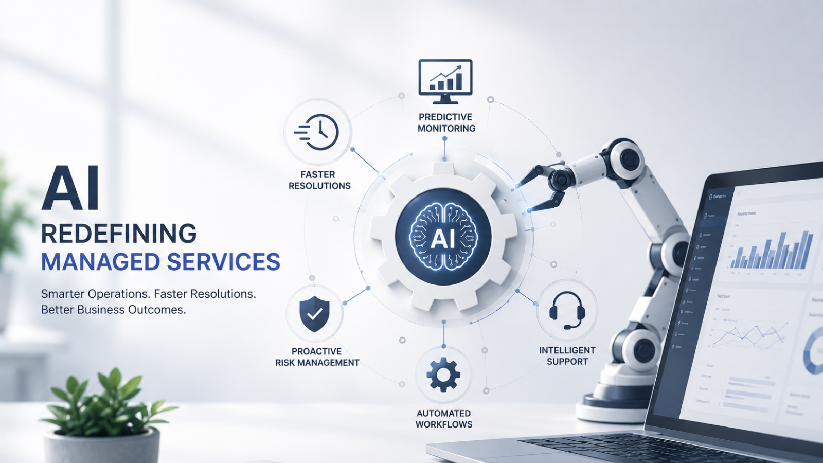
This is where AI in Managed Services is creating a meaningful shift, helping businesses move from reactive support toward intelligent, predictive, and increasingly autonomous operations.
The future of managed services is not simply faster support. It is smarter operations.
Why traditional managed services models are under pressure
Managed services evolved in an era where IT infrastructure was comparatively simpler.
Applications lived in data centers. Users worked from offices. Monitoring was centralized. Support processes were largely manual.
That environment has changed dramatically.
Modern businesses now manage:
- Hybrid cloud infrastructure
- Distributed workforces
- Remote endpoints
- SaaS ecosystems
- Cybersecurity monitoring layers
- Multi-location operations
- Always-on customer experiences
Every one of these environments generates operational data, alerts, dependencies, and risk signals.
The challenge is scale.
Human-led operations struggle when:
- Thousands of alerts require manual triage
- Root cause analysis spans multiple environments
- Repetitive tasks consume engineering time
- Response speed directly impacts business continuity
This is why traditional support-led managed services models are reaching their limits.
The next evolution requires intelligence, not just manpower.
What AI in Managed Services actually means
AI in Managed Services is often misunderstood as chatbot automation or simple scripted workflows. The reality is much broader.
AI enables managed services providers to process operational data at a scale and speed impossible through manual operations alone. It improves how IT environments are monitored, analyzed, prioritized, and optimized.
This includes:
Intelligent event correlation
AI identifies patterns across multiple alerts and connects related incidents instead of treating every alert as a separate event.
Predictive monitoring
AI detects early warning signals before failures impact users.
Automated root cause analysis
AI reduces investigation time by identifying likely fault sources faster.
Intelligent ticket prioritization
Critical issues are surfaced faster while noise is reduced.
Self-healing workflows
Predefined remediation actions can be triggered automatically.
The result is not the elimination of IT teams. It is the augmentation of human capability.
The 5 biggest ways AI is redefining Managed Services
1. Moving from reactive monitoring to predictive operations
Traditional monitoring tells teams when something has already gone wrong. AI changes that dynamic.
By analyzing historical patterns, performance signals, and behavioral anomalies, AI can identify issues earlier.
Examples include:
- Storage exhaustion trends
- CPU anomaly detection
- Application latency pattern changes
- Network performance degradation
Instead of reacting to incidents after impact, teams can intervene proactively.
This fundamentally improves uptime and resilience.
2. Reducing alert fatigue and operational noise
One of the biggest hidden challenges in enterprise IT operations is alert overload.
Monitoring platforms often generate massive volumes of notifications.
Many are duplicates. Some are low priority. Others are simply noise.
The impact?
Critical incidents get buried. Engineers waste time investigating false positives.
AI helps solve this by:
- Correlating duplicate alerts
- Grouping related incidents
- Identifying severity more intelligently
- Suppressing irrelevant operational noise
This improves response focus significantly.
3. Accelerating incident resolution
In traditional support models, incident resolution depends heavily on human investigation. That takes time.
AI improves resolution speed by helping with:
- Faster fault identification
- Log pattern analysis
- Context-aware escalation
- Automated remediation workflows
For businesses where downtime affects revenue, customer experience, or operations, this creates measurable business value.
4. Enabling smarter digital employee support
AI is also transforming end-user managed services. Employees no longer expect slow ticket-driven support for routine IT issues.
AI enables faster experiences through:
- Virtual IT assistants
- Automated password resets
- Intelligent self-service workflows
- Faster issue routing
This improves digital employee experience while reducing service desk workload.
For distributed enterprises, this becomes particularly valuable.
5. Helping Managed Services scale more intelligently
Scaling traditional managed services often meant adding more engineers. That model becomes expensive and inefficient at scale.
AI helps providers scale operational capability more intelligently by:
- Automating repetitive workflows
- Reducing manual incident dependency
- Improving operational visibility
- Enhancing engineering productivity
This creates stronger scalability without proportionally increasing manpower.
Real-world scenario: AI changes the operating model
A BFSI enterprise operating across multiple branches faced repeated service disruptions caused by delayed incident triage. The existing model depended heavily on manual monitoring and reactive escalations.
By the time issues were identified:
- Branch operations slowed
- User frustration increased
- Internal teams escalated repeatedly
After shifting toward AI-assisted managed services operations:
- Alerts were correlated intelligently
- Critical incidents were prioritized faster
- Response workflows triggered automatically
- Engineers focused only on high-value interventions
The result was not just operational efficiency. It was business continuity improvement.
Why AI matters especially for Indian enterprises
India’s enterprise IT landscape is evolving rapidly. Between GCC expansion, digital transformation programs, hybrid work adoption, and growing cybersecurity pressures, operational complexity is increasing significantly.
At the same time, access to highly specialized IT talent remains competitive.
AI helps address both realities by:
- Improving operational productivity
- Reducing dependency on repetitive human intervention
- Enabling scalable managed services delivery
For Indian enterprises balancing growth with operational discipline, AI becomes a strategic enabler not merely a technology enhancement.
What businesses should look for in AI-led Managed Services
Not every provider offering “AI-enabled” services delivers meaningful intelligence.
Businesses should evaluate:
1. Practical AI deployment
Is AI embedded into operations or simply positioned as a marketing message?
2. Event correlation capability
Can the provider reduce alert noise intelligently?
3. Predictive monitoring maturity
Can issues be detected before user impact?
4. Automation integration
Does AI connect with remediation workflows?
5. Human oversight
AI should strengthen engineering decision-making not create black-box operational risk.
The future: Toward autonomous Managed Services
AI’s role in managed services is still evolving.
The next phase includes:
- Autonomous remediation
- Predictive capacity management
- AI-led root cause analysis
- Self-healing infrastructure
- Outcome-driven IT operations
Solutions like ZerofAI reflect this shift helping organizations move toward more intelligent and automation-led service models.
This evolution will redefine how managed services are delivered over the next decade.
Conclusion
Managed services are no longer just about support coverage and faster ticket resolution. They are becoming intelligent operational platforms.
AI is helping businesses achieve:
- Faster issue detection
- Smarter prioritization
- Lower operational noise
- Improved uptime
- Better scalability
- Stronger employee digital experiences
To move forward:
- Evaluate where your IT operations remain reactive
- Identify repetitive incident-handling bottlenecks
- Assess whether monitoring creates visibility or operational noise
- Explore AI-led managed services models that improve business resilience
The future of managed services will not be defined by how many incidents your teams can handle manually.
It will be defined by how intelligently those incidents are prevented, prioritized, and resolved.
Reimagine Managed Services with AI-Led Operations
Discover how AI-enabled Managed Services can improve operational resilience, accelerate response times, and help your business scale smarter IT operations.
The sooner intelligence becomes part of your service model, the stronger your ability to manage future complexity.